Create Form
The Forms section allows you to easily create forms using the drag-and-drop method to collect data from your customers. In this area, you can design custom forms by adding form fields suitable for your needs and publish them. You can share the forms you publish with your customers to have them fill them out, thus managing feedback, orders, applications, or different data collection processes more efficiently.
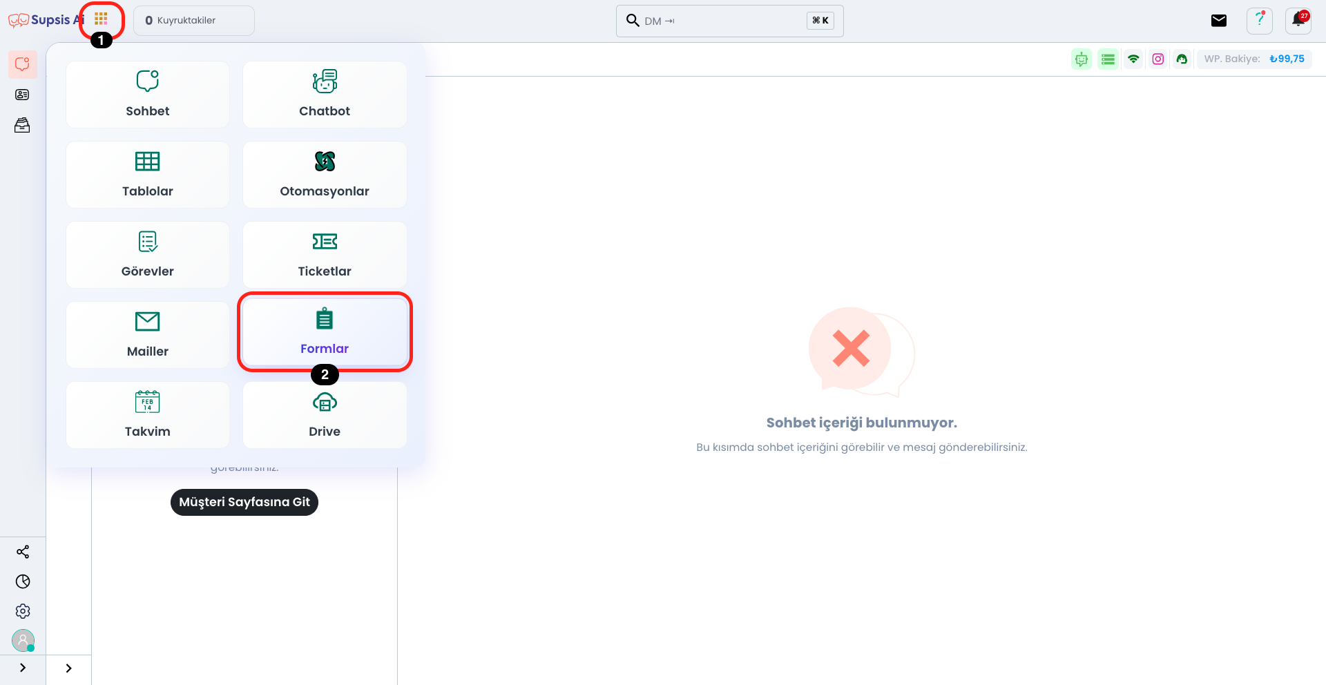
Click on the Applications icon right next to the Supsis AI logo located in the upper left. Continue by clicking the "Forms" button in the marked section from the opened menu.
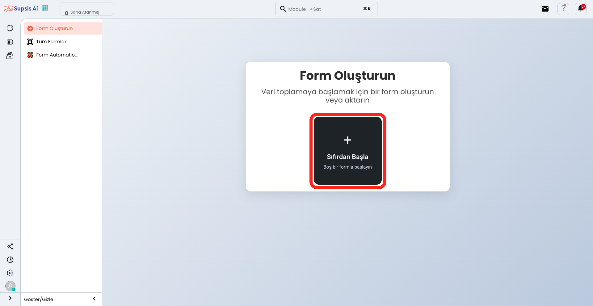
On the opened page, you can go to the form creation page by clicking the "Start from Scratch" button.
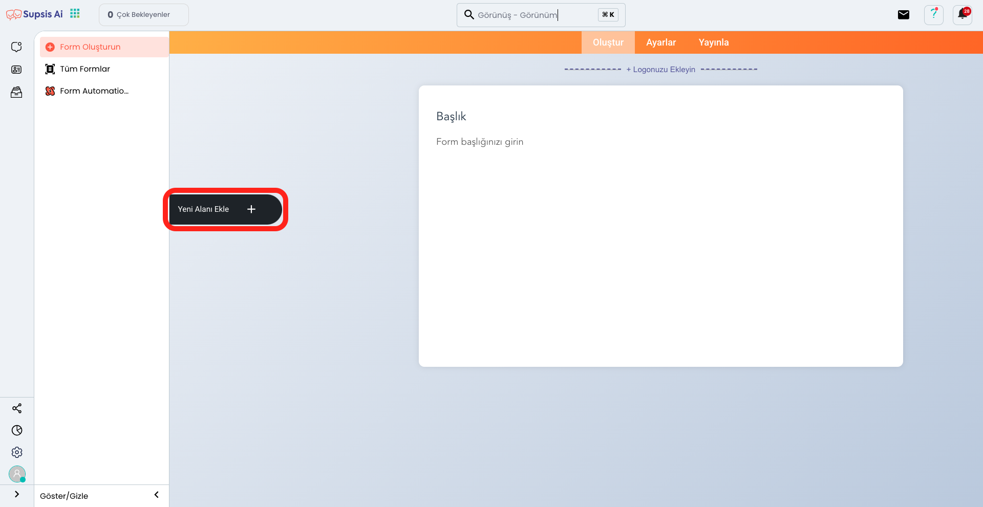
After coming to the form creation page, you can view the menu containing the fields you can add by clicking the "Add New Field" button.
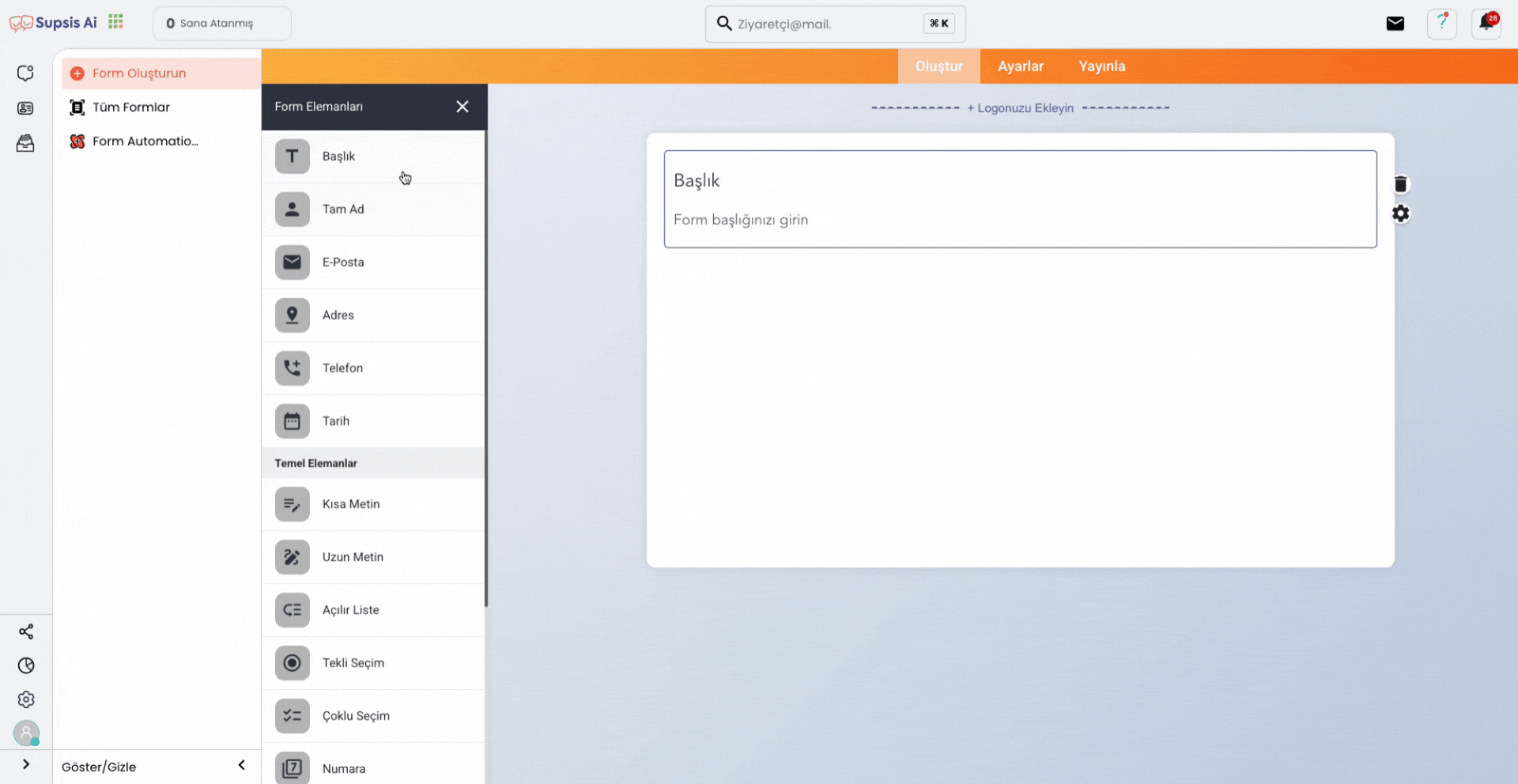
In the opened area, you can easily add form fields suitable for your needs using the drag and drop method. You can add text boxes, checkboxes, dropdown menus, and other custom fields to your form to determine the data you want to collect from your customers. This feature makes the form creation process fast and practical while improving the user experience. By customizing each field you add, you can shape your form completely according to your needs.

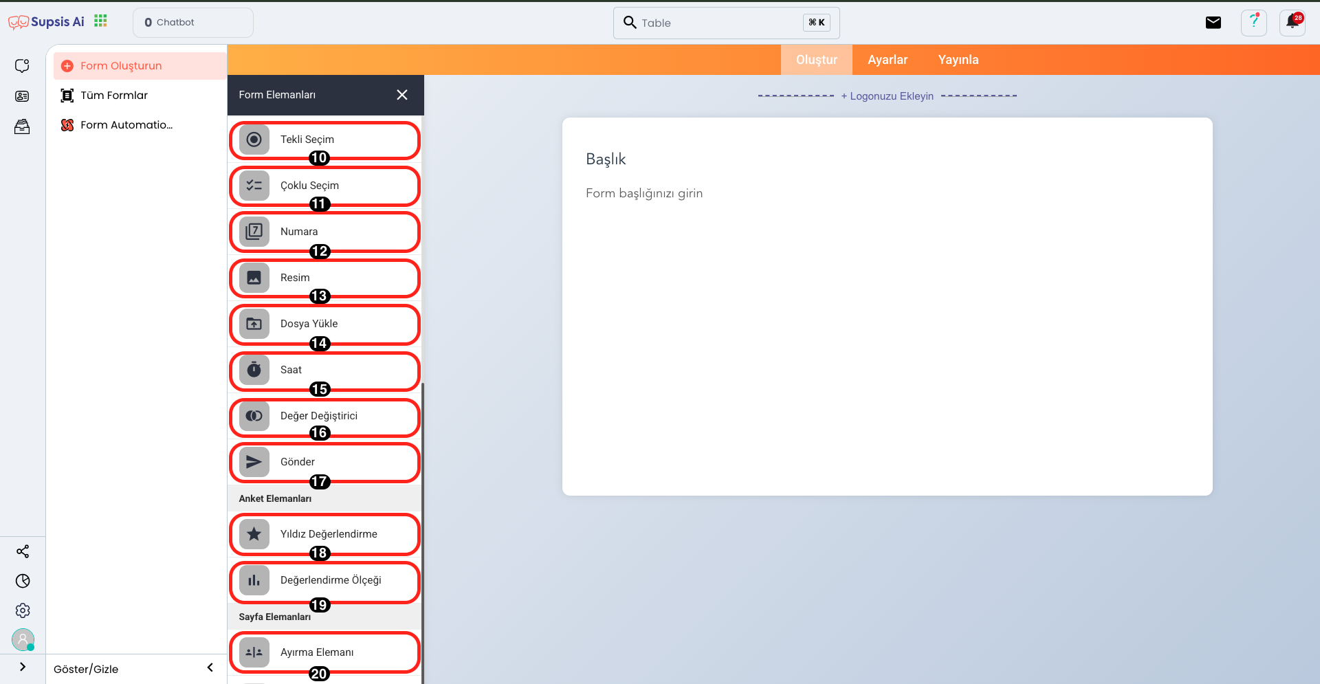
Form Creation Elements:
- Title
- Full Name
- Address
- Phone
- Date
- Short Text
- Long Text
- Dropdown List
- Single Selection
- Multiple Selection
- Number
- Image
- File Upload
- Time
- Value Changer
- Submit
- Star Rating
- Rating Scale
- Separator Element
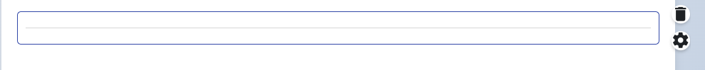
1.) Title
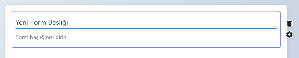
This element allows you to create a prominent title at the top of the form. By adding a title, you can clearly express the purpose of the form and help users understand the form content faster. The title can be customized with various customization options such as text size, color, and alignment.
2.) Full Name
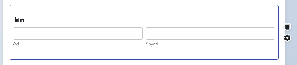
This field is used for users to enter their first and last name information. It is an important data entry field for determining the identity of the person filling out the form. It can usually be marked as a required field and validation rules can be applied to prevent incomplete or incorrect entries. It is designed as a wide text box for the user to fill out comfortably.
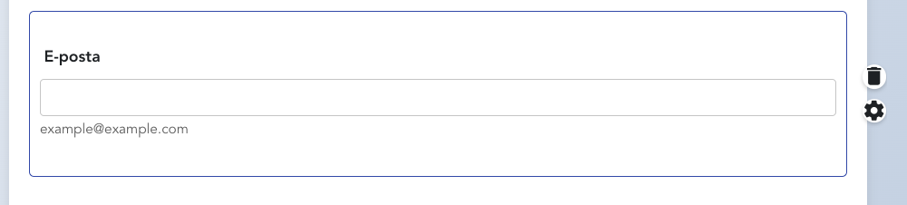
3.) Email
 ,
,
This field allows users to enter a valid email address. It is usually determined as a required field for communication with the form or sending automatic responses. Validation rules can be applied to prevent the user from entering a wrong or incorrect email. Additionally, there is a mechanism that checks whether the entered email address is in the correct format.
4.) Address
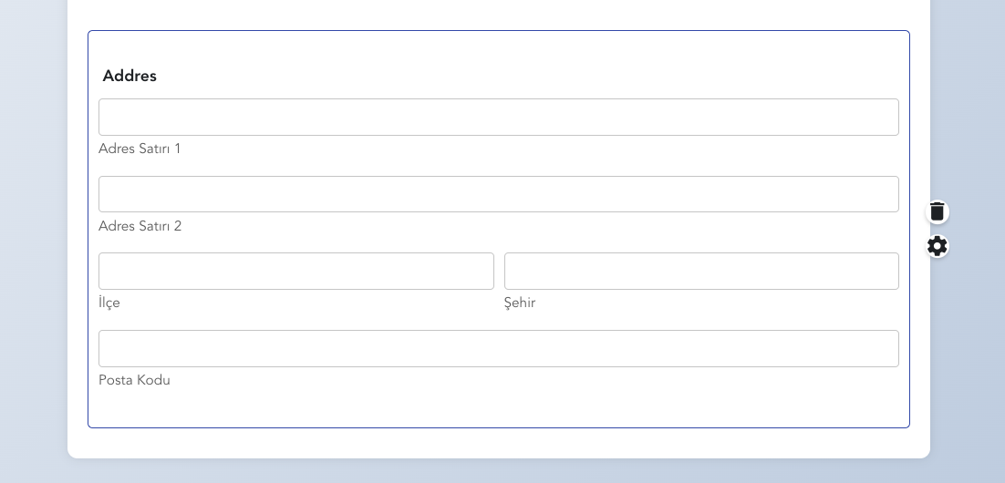
This field allows the user to enter their complete address information. It is usually presented with a series of sub-fields including information such as street name, building number, city, postal code, and country. The address field can have a detailed format to ensure that users enter all the address information needed for delivery or communication correctly. Additionally, it can have separate boxes for each address component to be user-friendly.
5.) Phone
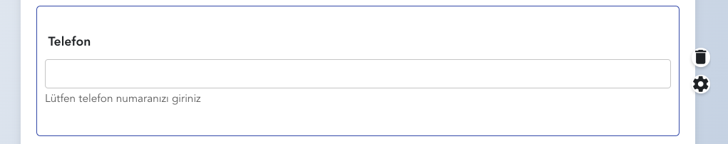
This field allows the user to enter their phone number. It is usually determined as a required field to provide an alternative channel for communication. The phone number is a field that must be entered in a specific format (for example, with country code). Validation rules can be applied to prevent the user from entering wrong or incomplete information. Additionally, extra validations can be added to check if the phone number is in international format.
6.) Date
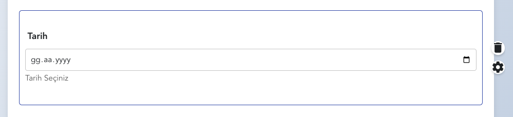
This field allows the user to select a date. It is usually used for event dates, birthdays, reservation dates, or other time-based operations. The date field can be presented visually through a calendar (datepicker), allowing users to select dates faster and more accurately. Additionally, options such as date format (day/month/year or year/month/day) can be determined, ensuring that users enter dates in the correct format.
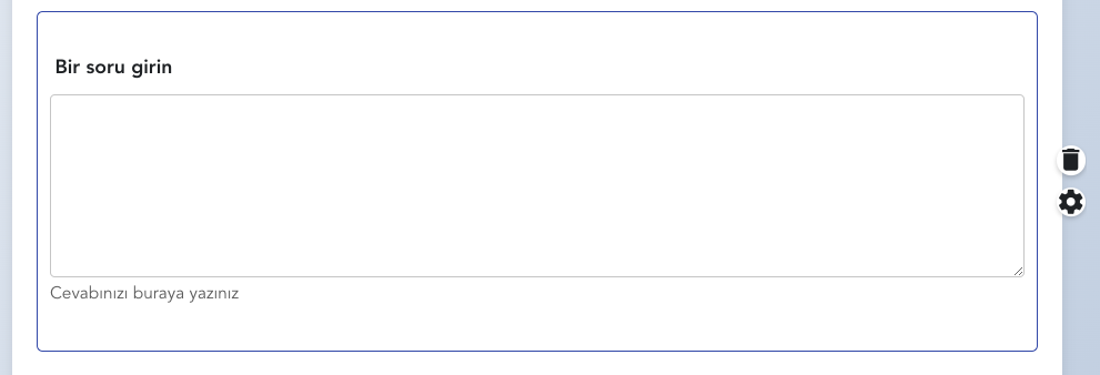
7.) Short Text
This field allows the user to enter a short text. It is usually used for names, titles, subjects, or other short responses. Users can write a few words or sentences in this field. Short text fields are usually designed to be single-line and can be limited with a specific character or word limit. This feature is ideal for getting quick responses in your form, allowing you to request information freely but briefly and concisely from the user.
8.) Long Text
This field allows the user to enter a longer and more detailed text. It is usually used in situations where explanations, comments, feedback, or longer responses are requested. The long text field is usually presented as a box consisting of multiple lines and allows users to write freely. A character limit can be set within this field, so the length of the text to be written can be controlled. The long text field allows you to get broader explanations and makes the form more flexible.
9.) Dropdown List
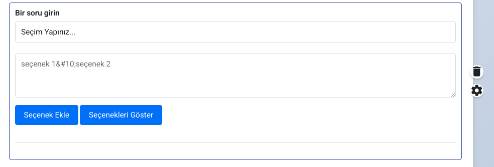
The dropdown list allows the user to select one of the predetermined options. This form element is used to present long option lists in a more organized way. When the user clicks on the dropdown list, the options become visible and they fill out the form by selecting one from the list. It is usually preferred when countries, cities, categories, or any limited options are to be presented. The dropdown list allows users to make correct and quick choices while simplifying the form layout. This element is useful for preventing incorrect or incomplete data entries.
10.) Single Selection
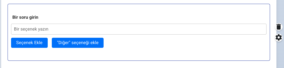
Single selection allows the user to select only one from multiple options. This form element is usually used in binary choices such as "Yes/No", "Male/Female", "Approved/Unapproved" or in situations requiring a single choice. The user can select only one among the predetermined options. This element makes it easier for users to make choices while ensuring that responses are correct and clear. It is usually presented visually as checkboxes or radio buttons.
11.) Multiple Selection
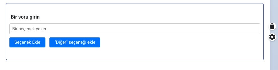
Multiple selection allows the user to make multiple selections from multiple options. This form element is ideal for situations where users need to mark multiple responses. For example, for a question like "Which products are you considering purchasing?", users can make choices among multiple options. The options are usually presented as checkboxes and the user can mark multiple boxes. This feature is used especially in surveys, feedback forms, or situations where options will be multiple.
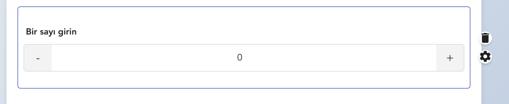
12.) Number
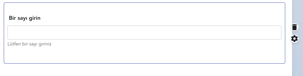
The number form element is a field that allows the user to enter only a numerical value. It is usually used for phone numbers, age, quantity, or other numerical data entry. This form element allows the user to make an entry consisting only of numbers and usually comes with plus (+) or minus (-) buttons, so the user can increase or decrease the number. This field is preferred to ensure accuracy in situations where numbers need to be entered and to prevent incorrect data entries.
13.) Image
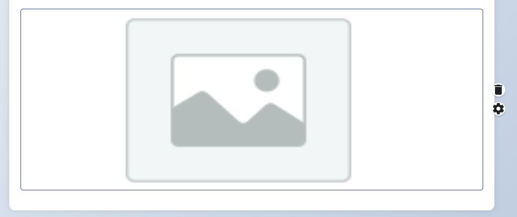
The image form element allows users to add a visual element within the form. This feature allows only the display of the image without uploading any file. It is usually used to add titles, logos, or any visual elements. Users can make your form more visually appealing by adding the image element and strengthen your message with visuals. The image element provides a practical method for displaying visual content in the form.
14.) File Upload
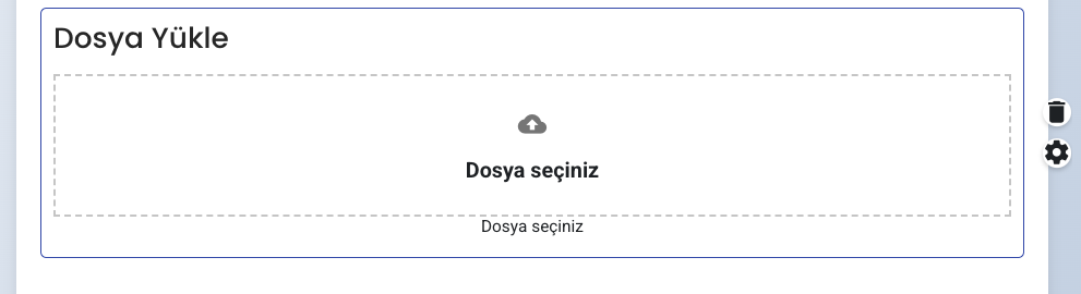
The "File Upload" form element allows users to upload files from their computers. This feature allows you to receive documents, images, PDFs, or any other file type through the form. Users can easily select and upload specific files using this field. The file upload feature is quite useful especially for application forms, support requests, or operations that require any file submission. The uploaded files are saved together with the data provided by users who complete your form.
15.) Time
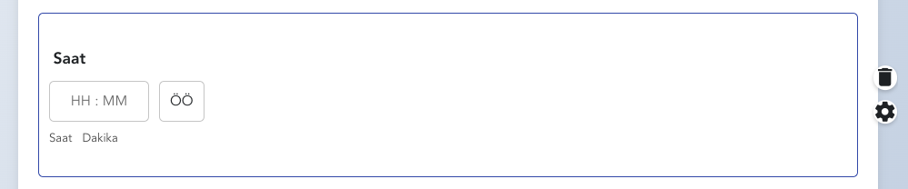
The "Time" form element allows users to select a time. This feature is useful for situations that require selecting a specific time period. Users can complete the form by specifying an hour and minute in this field. For example, this field can be preferred for time selection in an appointment form or event participation form. The time element provides an accurate and effective data collection tool for operations requiring time management.
16.) Value Changer
 v
v
The "Value Changer" form element allows users to increase and decrease a specific value. This feature is usually used in numerical data collection operations. For example, it can be used to allow users to select the quantity they want in a product order form. Users can easily increase and decrease values by clicking the plus (+) and minus (-) buttons. This element helps collect numerical data quickly and accurately, and is an ideal solution for situations where quantity selection is important.
17.) Submit
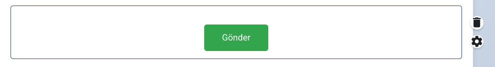
The "Submit" form element allows users to send their information to your system after filling out the form. This element is the final step that ensures the completion of the form and the saving of data. It is usually located as a large and eye-catching button at the bottom of a form. Users can send all information to the system by clicking the "Submit" button after filling out the form and receive a confirmation message indicating that the form has been completed successfully. This element is important for ending user interaction and completing the data collection process.
18.) Star Rating
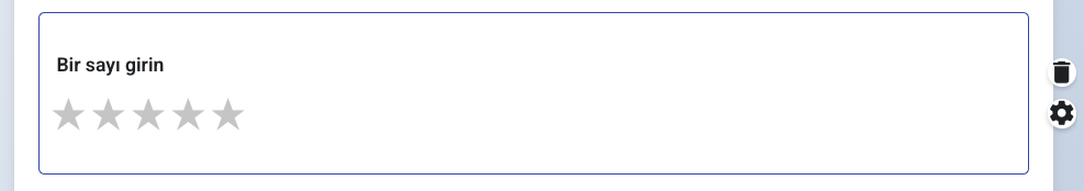
The "Star Rating" form element allows users to rate a service, product, or experience. This element is usually visible with a star range from 1 to 5, and users select by clicking on the stars to score their experiences. Star Rating is an effective way to collect user feedback and measure customer satisfaction. This element allows users to communicate their satisfaction quickly and visually. Star ratings provide important data for understanding the overall quality of a product or service and can help you better analyze user preferences.
19.) Rating Scale
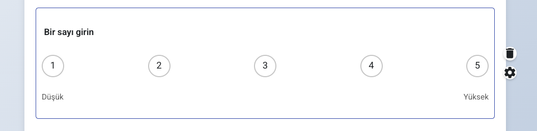
The "Rating Scale" form element allows users to rate a topic. This element usually allows users to score a product, service, or experience within a specific range (for example, between 1 and 10). The rating scale provides more detailed and flexible responses when getting a rating score, as users can express their satisfaction levels more subtly instead of simple answers like "good" or "bad". This element is useful especially for getting feedback and measuring user experiences more accurately.
20.) Separator Element
The "Separator Element" form element is used to make your form more organized and readable. This element adds a visual boundary or space between form fields. It usually appears as a horizontal line and provides a clear distinction between different sections of the form. This element that separates sections for users to focus more easily while filling out a form is especially useful in complex forms or forms containing multiple information categories. The Separator Element improves the overall appearance of your form and enhances the user experience.