Drag and Drop Chatbot
Basic Chatbot Blocks
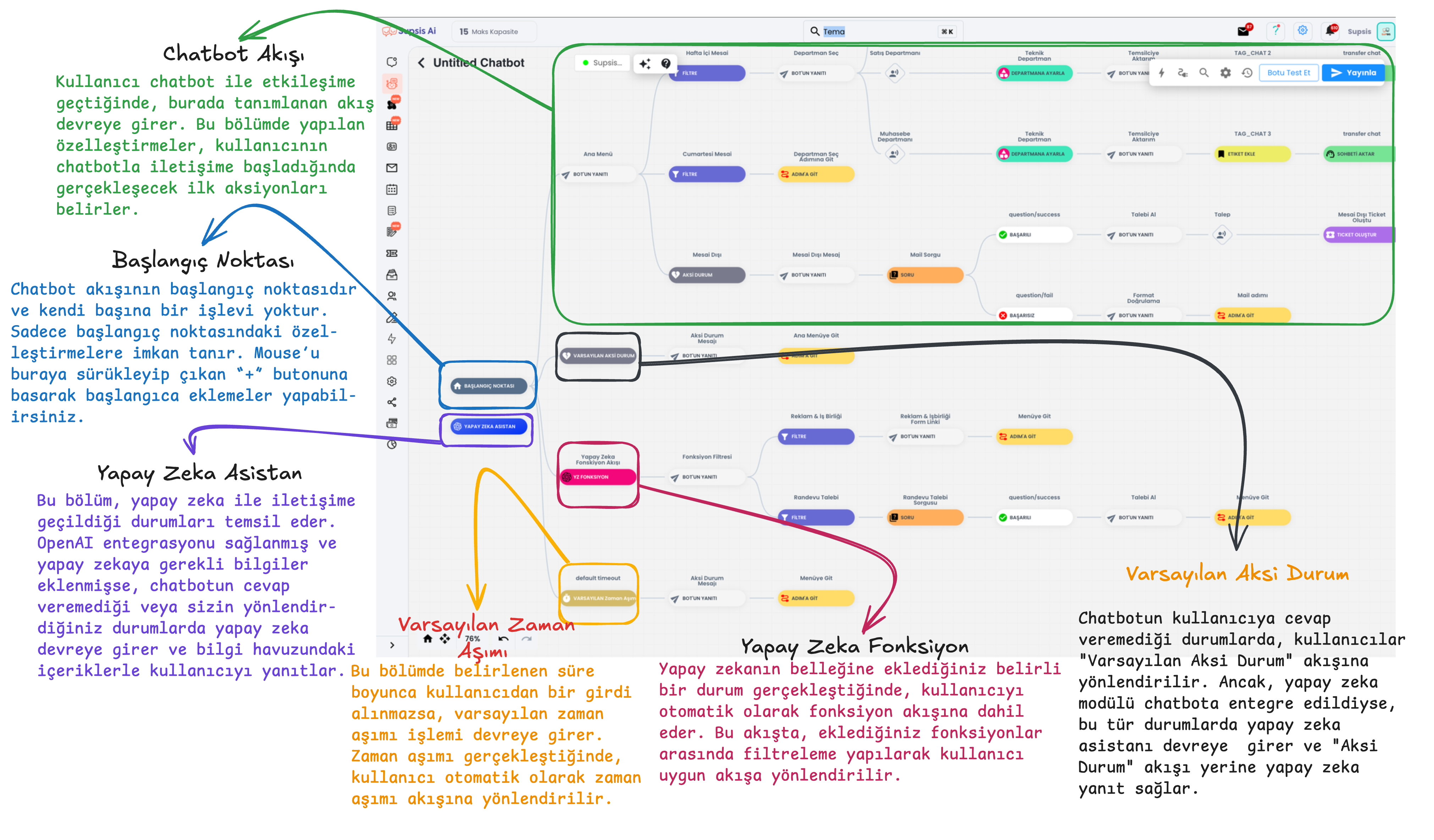
Starting Point: It is the starting point of the chatbot's flow and this section has no function within the flow. The chatbot starts from this point, you can provide starting point customizations by dragging your mouse over the starting point.
AI Assistant: When the chatbot cannot respond or provide support to the user, the artificial intelligence system comes into play. If OpenAI integration is provided and information is added to the AI knowledge pool, it provides responses to users at points where the chatbot cannot respond, based on the information within artificial intelligence. The AI assistant block in the image has no function, it only exists to show that the user is interacting with artificial intelligence during testing within the flow. To provide customizations within artificial intelligence, you need to click on the icon with stars in the upper section of the chatbot, and the section where you can access the AI knowledge pool is presented with card number 1 in the image below.
Default Timeout: If the user does not interact with the chatbot for the duration you specify through the default timeout, the chatbot evaluates this situation as "timeout" and triggers the actions you specify behind the default timeout.
Default Otherwise: When the chatbot cannot detect the input from the user, it redirects to the Default Otherwise flow. In this section, you can warn the user to proceed with the chatbot's directions and then send them to the chatbot step you specify. If you use the chatbot module integrated with artificial intelligence, the AI assistant will come into play in cases where the chatbot cannot respond and will answer the user's questions based on the information you have loaded into it.
Flow Start: When the user interacts with the chatbot, communication begins with the actions you specify at the flow start. This section contains the first actions or messages to be shown to the user. The flow started from the "Start Here" section starts from this point onwards with your
Chatbot Content
Module content:
- AI Knowledge Pool
- Access to Chatbot Documentation
- Chatbot Blocks
- Integration
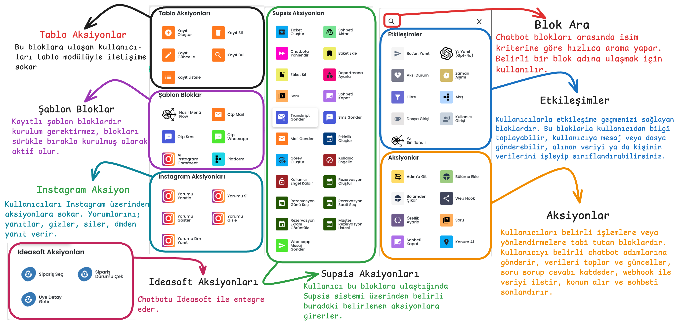
- Search Blocks by Name
- Bot Settings
- Versions (Return to Old Chatbot Version)
- Test Bot
- Publish Scenario
- Return to Starting Point
- Fullscreen
- Chatbot Proximity Ratio
- Step Forward/Backward
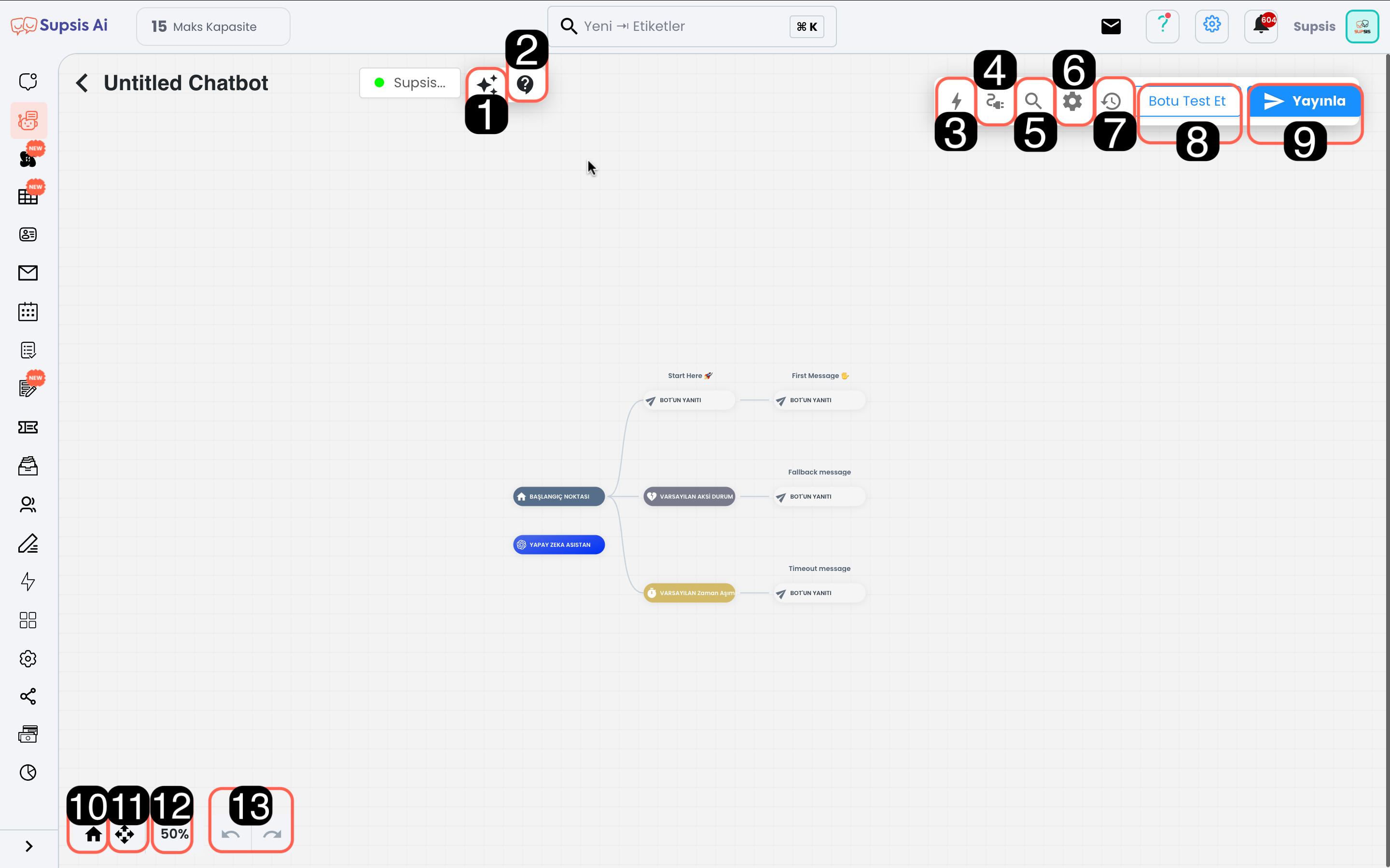
1-) AI Knowledge Pool
The AI module needs a knowledge pool to respond to user questions. This section is where the information necessary for artificial intelligence, which will start working at points where the chatbot is insufficient, to give correct and comprehensive responses is managed. From here, you can add the information that artificial intelligence needs to respond to various questions that users might ask, and you can edit the style and function contents of artificial intelligence.
2-) Access to Chatbot Documentation
From this section, you can access user guides to get more information about chatbot setup. You can benefit from the documentation to understand each feature of the module in detail.
3-) Chatbot Blocks
These are the building blocks necessary for the chatbot to interact with users. Thanks to blocks, you can create different dialog flows and usage scenarios. For example, to enable the chatbot to capture specific user inputs, you can drag and drop user inputs and then immediately drag and drop the appropriate blocks for the chatbot's operation. These blocks determine how the chatbot will move. Each block performs a specific task and provides communication between the user and the chatbot.
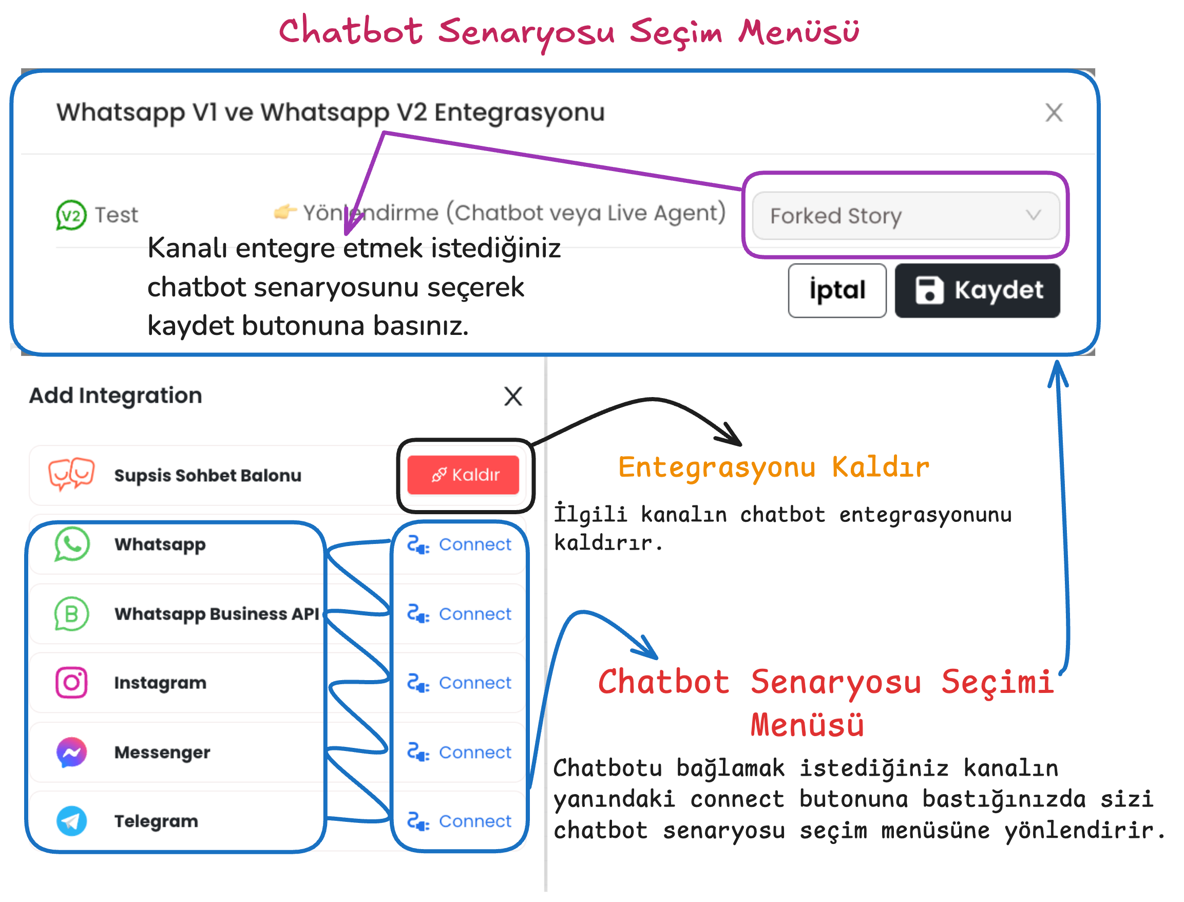
4-) Integration
Provides integration of the chatbot scenario with the platforms where the chatbot will be used. After pressing the connect button next to the communication channel where the chatbot will be integrated, you can make the appropriate scenario selection. After providing scenario integration, you can activate the selected chatbot using the publish button in the upper right.
5-) Search Blocks by Name
Allows you to search among the chatbot blocks you have created. When you want to reach a specific block in the chatbot, you can quickly find it by typing the block name here. This feature provides ease of access, especially in complex chatbot designs.
6-) Bot Settings
Allows you to configure general settings such as the chatbot's language, navigation tool that allows you to navigate within the scenario, confidence level and start message.
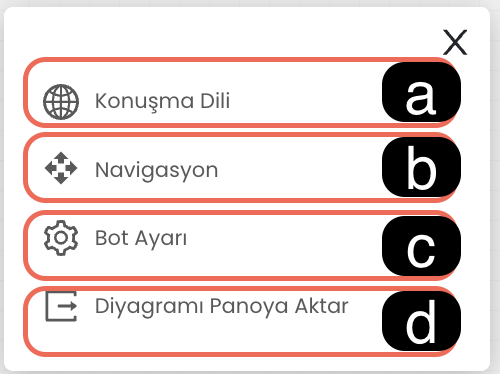
6.a. Conversation Language: Determines the language the chatbot will use when responding to users. This ensures that the chatbot responds to customers in the appropriate language.
6.b. Navigation: Allows you to select your preferred navigation tool for navigating in the chatbot editing screen. (For example: Trackpad or Mouse)
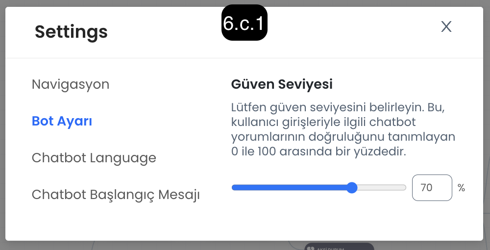
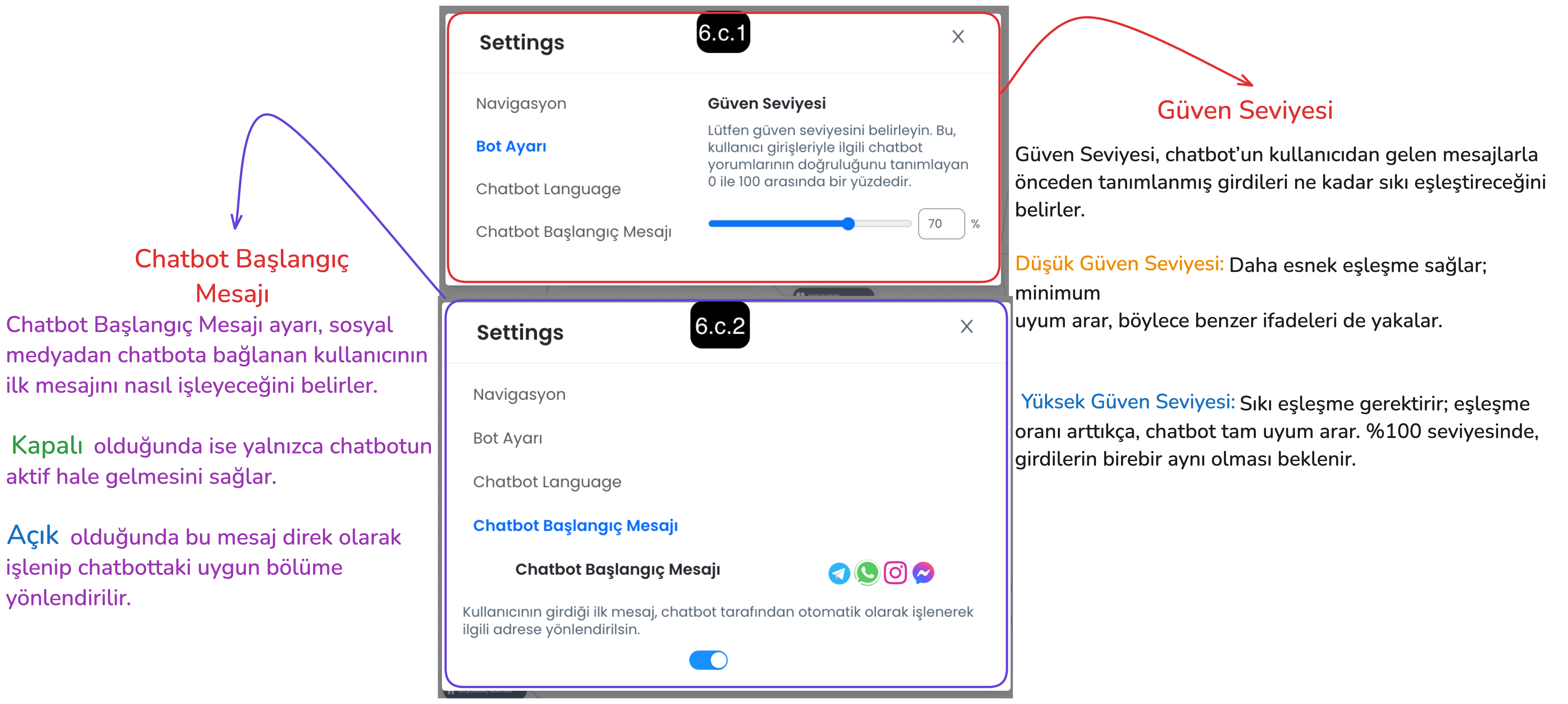
6.c. Bot Setting
Confidence Level: Determines how strictly the chatbot will evaluate incoming user messages. - Low Confidence Level: The chatbot achieves a broader match with user messages, easily recognizes similar expressions. - High Confidence Level: The chatbot must fully match the user's messages, in this case exact message matching is sought.
Start Message: Determines how the chatbot will handle the first message from the user. - When Open: The user's first message is automatically processed by the chatbot and the message is captured and directed to the appropriate section. - When Closed: It only wakes up the chatbot, the first message only starts the chatbot, the first message from the user is not processed directly.
6.d. Copy Diagram to Clipboard: You can copy the chatbot flow diagram using this button, and paste the chatbot diagram to this panel by using Ctrl+V buttons after entering the chatbot menu of your current panel or a different Supsis panel.
7-) Versions (Return to Old Version)
This feature is used when you want to undo incorrect arrangements made in your chatbot scenario or return to an old version. This way, you can activate an old version of the chatbot and prevent any disruption.
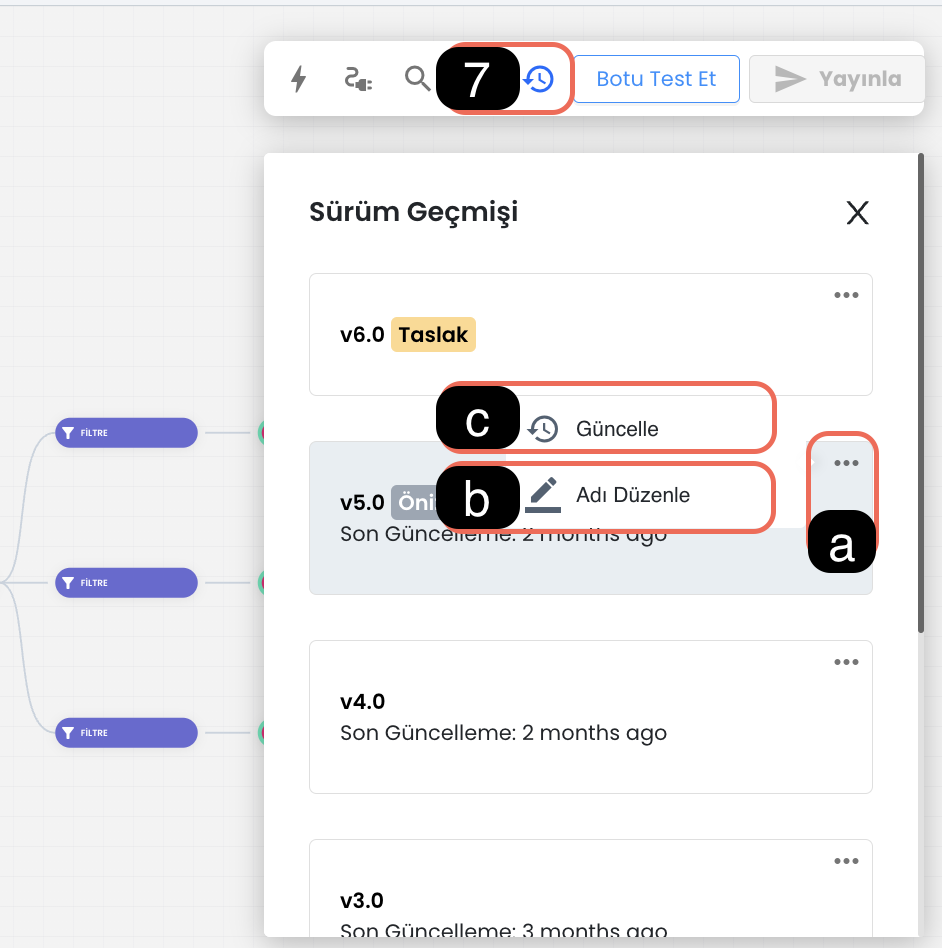
7.a. Version Settings: You can activate version settings using this button, through the settings you can name versions, edit their names or activate an old version.
7.b. Version Name: The version naming feature provides easy access to old versions. Each version can be named for easy identification.
7.c. Update Version: After selecting the version you want to return to, you can make transitions between versions by clicking the three dots and using the "Update" option. You can click on the relevant version to preview the content of the chatbot version.
8-) Test Bot
The "Test Bot" feature allows you to test your chatbot in a simulation environment before integrating it into your channels. This test environment allows you to observe how the chatbot will behave with customers. While the test environment generally offers an experience similar to the live environment, it may show differences in some cases. To test the customer experience more realistically, you can use the "Customer Test" page by following the steps in  this document .
9-) Publish Scenario
After making arrangements in your chatbot scenario or providing integration, you can activate the new version by pressing the "Publish" button. This process creates a new chatbot version and publishes new arrangements. If you encounter an adverse result while testing your updates, you can return to the created version and continue your use without problems.
10-) Return to Starting Point
With this button, you can quickly return to the chatbot's starting point.
11-) Fullscreen
You can use this button to view the chatbot scenario in full screen. Full screen mode provides a wide workspace, allowing you to work more comfortably on the scenario.
12-) Chatbot Proximity Ratio
This option allows you to zoom in and out on the chatbot's visual scenario flow. Settings can be arranged to zoom with mouse or trackpad:
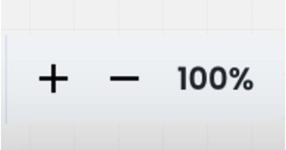
- "-" Button: Zooms out the view.
- "+" Button: Zooms in the view.
13-) Step Forward/Backward
You can use these buttons to take the changes you made on the chatbot to the previous step or forward step. This way, you can easily switch between your recent changes.
Let's Create an Example Flow Together
In this image, a chatbot flow example is shown step by step based on filters and actions. Here are the basic blocks used and their functions:
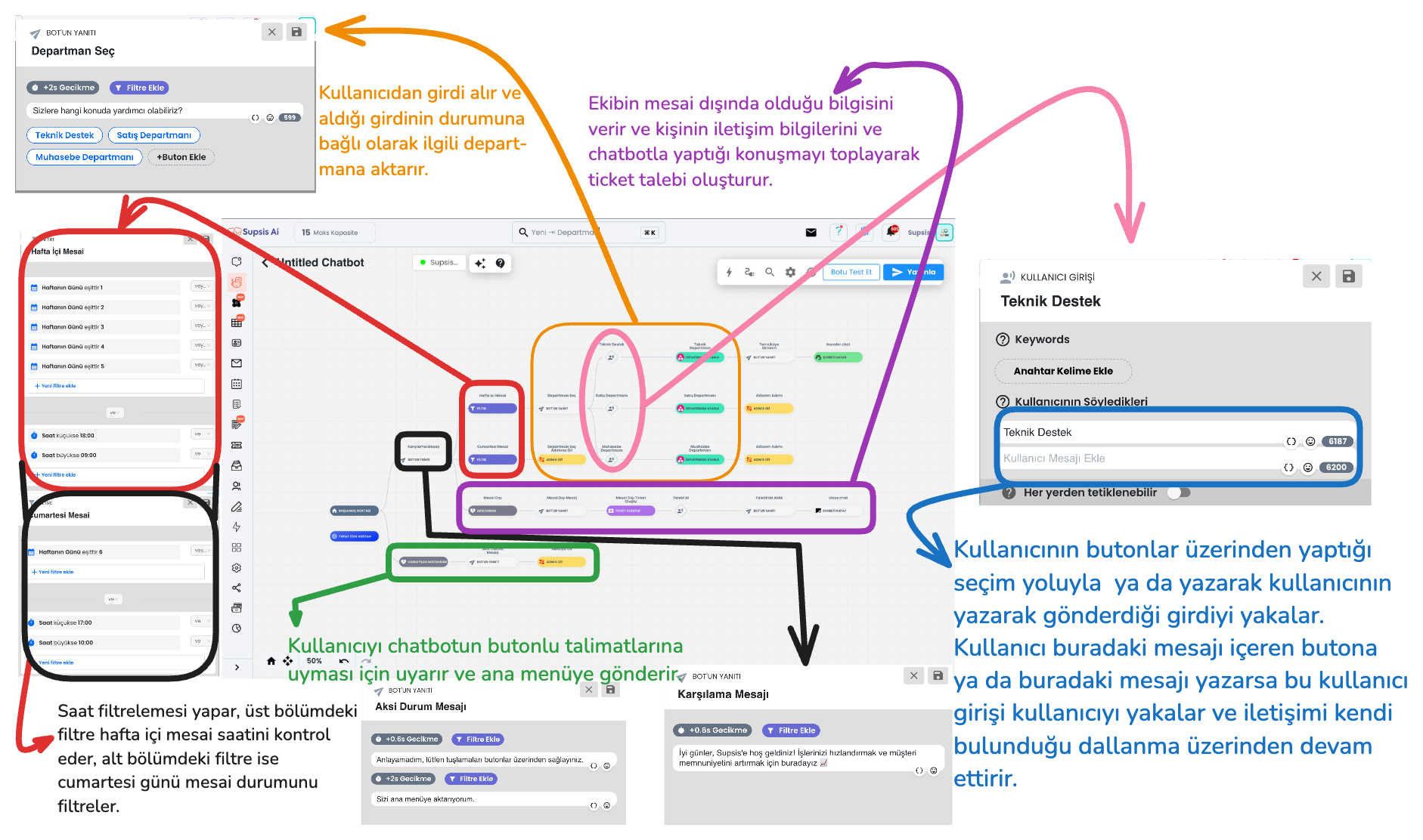
1-) Filters
This is the description of the filter section of the chatbot flow in the upper section.
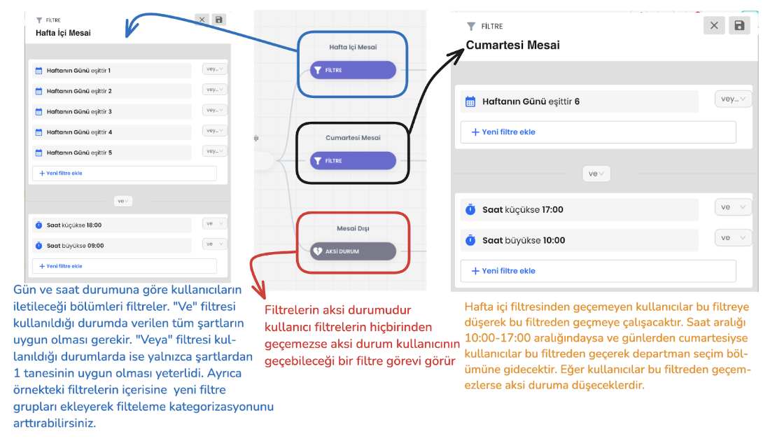
Filter Hierarchy: The user tries to pass through the defined filters starting from the top. If the user's input does not meet a filter condition, it moves to the filter below. This process continues sequentially among all filters. If the user cannot pass through any filter, the system is directed to the "Default (General) Otherwise" scenario.
Local Otherwise: The "Otherwise" block at the end of the filters comes into play when no filter condition is met. This serves as the last filter that the user can pass through and directs the user to take action.
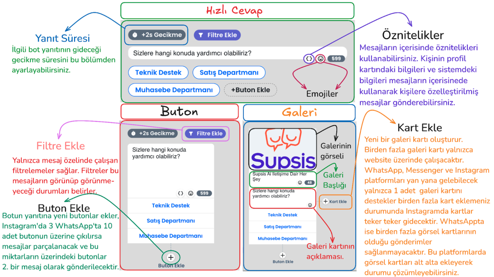
2-) Bot Responses with Buttons (Quick Reply / Button / Gallery)
Bot responses manage the interaction style established with the user through the inputs received by the chatbot. Among the bot response types that direct users to buttons; there are various interaction options such as quick reply, button and gallery cards. Each response type has basically the same function, but offers a different experience to the user with small functional changes and visual changes. For example, the quick reply button type is used in the image below.
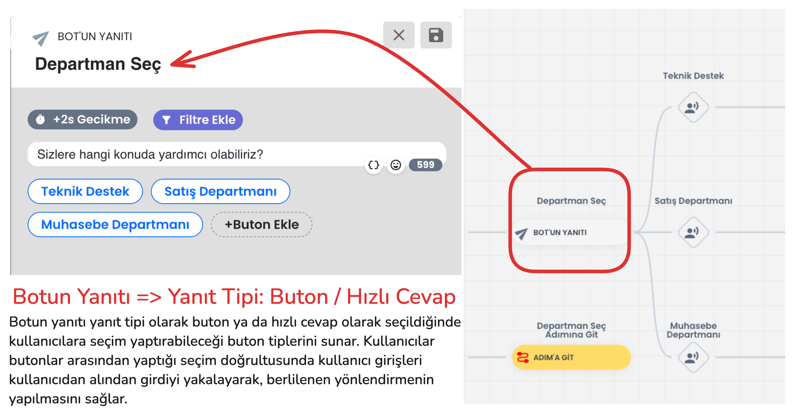
In addition to visual appearance differences between these button types, there are also functional differences. The functional differences between button types are explained in the section below. After learning the details and selecting the appropriate button type, you can set up your flow appropriately.
- Quick reply
- Usage Purpose: Enables the user to make a quick selection. After the user makes a selection, this response disappears and the bot moves to the next step.
-
Features: Quick reply button type; takes input from the user specifically for website, Instagram and Messenger and disappears. Unlike other button types on the Instagram platform, it allows adding more than 3 buttons.
-
Button
-
Usage Purpose: Offers specific options to the user, has no additional features. Buttons remain on the screen after the user makes a selection on all platforms.
-
Gallery
- Usage Purpose: Used to make a more interactive presentation by adding visuals and descriptions.
- Features: Can have a visual title, description and a maximum of 3 buttons below. In WhatsApp, more than 1 gallery card cannot be placed side by side, otherwise message sending will not be performed.
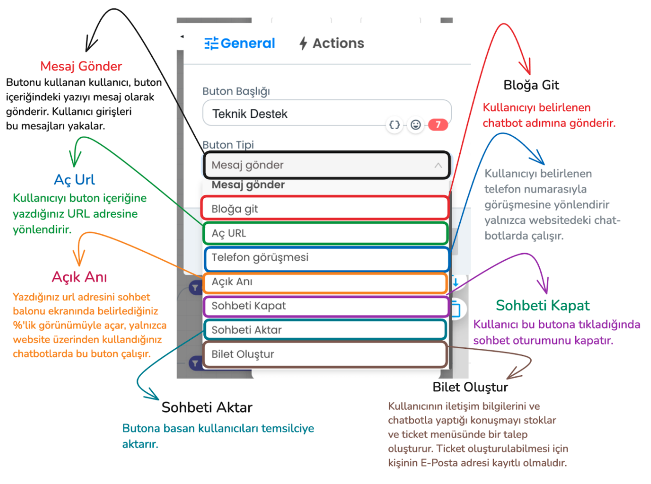
In the example above, send message and go to block button types should be used to create the flow we use in the flow. Through these button types, the bot can understand the user's request and provide appropriate direction. However, there are additional button types you can use in addition to these button types.
- Send Message: The user clicks the button to convey the message in the button's content, the bot processes the input received from the user and provides appropriate direction.
- Go to Block: Sends the user to the specified chatbot step
- Open URL: Redirects the user to a URL you specify.
- Phone Call: Redirects the user to call a specific phone number (website chatbot only).
- Open Moment: Opens the specified URL on the chatbot screen in the size you specify.
- Close Chat: Ends the chat session of the user who presses this button.
- Transfer Chat: When the user clicks this button type, the chat session is transferred from the chatbot to the live support representative. The representative takes over the chat.
- Create Ticket: Saves the user's contact information and chat content and conveys it to the support team as a ticket. A ticket will only be created if the user's email information is available on the Supsis site, if you have received email information from the person before or if you get this information from the user through the chatbot.
Things to Consider
- Button Limits:
- Instagram and Messenger: Maximum 3 buttons in a single bot response.
- WhatsApp: Maximum 10 buttons in a single bot response.
- Limit Exceeded Situations:
- If 5 buttons are added in Instagram and Messenger, the first 3 buttons are displayed in the first message, and the remaining 2 buttons are displayed in the second message.
- If there are 12 buttons in a bot's response during WhatsApp usage, the first 10 buttons are sent in one message, and the remaining 2 buttons are sent in the next message.
- Button Content Length:
- Character Limit: In WhatsApp, Instagram, Messenger and Telegram, a button can be maximum 20 characters. Contents longer than 20 characters only show the first 20 characters.
- Web: There is no character limitation on the website.
- Platform Limitations:
- Some button types do not work on every platform. However, there are no restrictions on button usage on the website.
- Supported Button Types (Instagram, Messenger, Telegram and WhatsApp): Send Message, Go to Block, Close Chat, Transfer Chat, Create Ticket (Ticket creation only becomes active if the user's email information is available).
- Gallery Cards:
- Web: There are no restrictions on the use of gallery cards on the website.
- Other Platforms:
- Maximum 3 buttons can be added to the gallery card.
- In WhatsApp, more than 1 gallery card cannot be placed side by side, otherwise message sending will not be performed.
- If more than one gallery card is added on other platforms, the cards are transmitted by splitting.
These rules are important details for the chatbot to work properly on different platforms. These rules must be followed during setup.
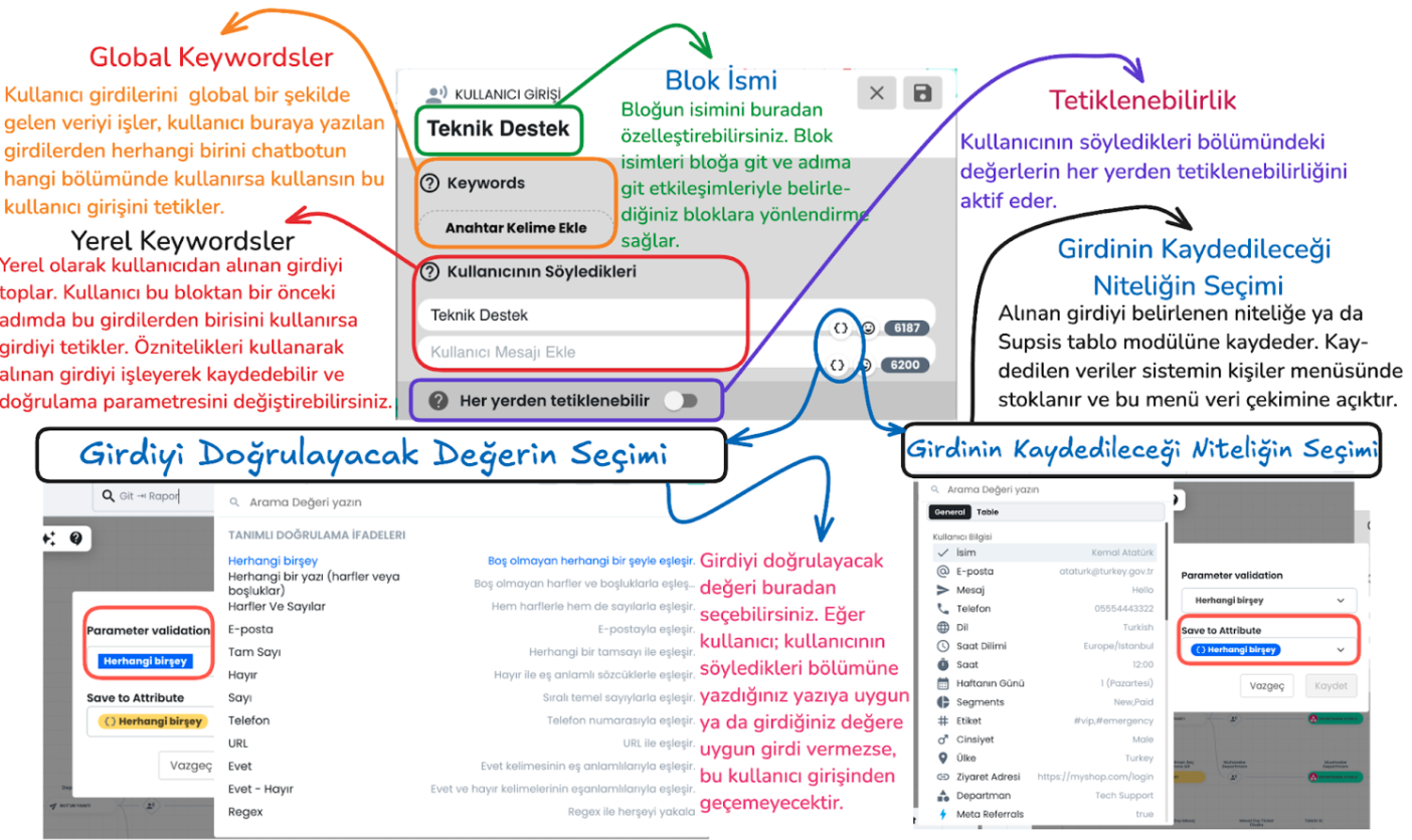
3-) User Input
User Inputs provide a section used for the correct processing, saving, validation of data received from chatbot users and triggering of determined actions. This area is important for providing more effective interaction with the inputs received from the user.
Main Components of the Block
Global and Local Keywords
Global Keywords
These are keywords that are valid anywhere throughout the entire chatbot. When the user writes one of these keywords, they can trigger the relevant user input regardless of which stage the chatbot is in.
Local Keywords
These are keywords that are valid in a specific step. They are only used within the block in front of them and are not triggered in other steps. This provides more focused keyword usage.
Block Name
This section is used to customize the block name. The block name makes it easier to connect with other blocks. For example, "go to block" or "go to step" interactions determine the target through the block name and allow directing the user to the correct block.
Triggerable from Anywhere
When this feature is activated, the determined local keyword inputs become triggerable from anywhere within the entire chatbot. This makes local keywords work like global keywords.
Attributes
Selection of Value to Validate Input
Parameter Validation: The chatbot offers various validation criteria to determine the accuracy of data received from the user: - Regex: Regex codes can be used to provide more customized validation. You can get help from ChatGPT to create regex and enter this regex in the relevant section.
Selection of Attribute to Save Input
Save to Attribute: The data received from the user is saved to a determined user attribute or to the determined section of the table module.
For example, an input with email validation selected as the validation type can be saved to the "Email" attribute in the user's profile card. This saved data is stored in the person's profile card and can be retrieved from the system when needed.
Note:
The confidence level in bot settings determines how strictly the chatbot will match incoming user inputs:
- Low Confidence Level: The chatbot achieves a broader match with user messages and easily matches similar expressions.
- High Confidence Level: The chatbot must fully match the user's messages. In this case, exact message matching is sought.
Button and User Input Interactions
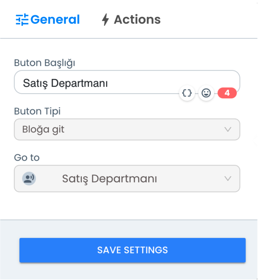
1) Go to Block Button Type
With the "Go to Block" Button Type, when the user uses the determined button, they are directed to a predefined block.
After selecting this button type, you can directly direct the user to this step by selecting the block name you want to go to from the "Go To" section. This feature allows the user to access the steps they need during chatbot interaction.
-
Button Title: Determines the button name visible to the user. This title represents the button the user interacts with and clearly expresses what the user will click on.
-
Go To Selection: You select the block name where the user will be directed when they click this button. This option ensures that the user is directed to a specific step or block.
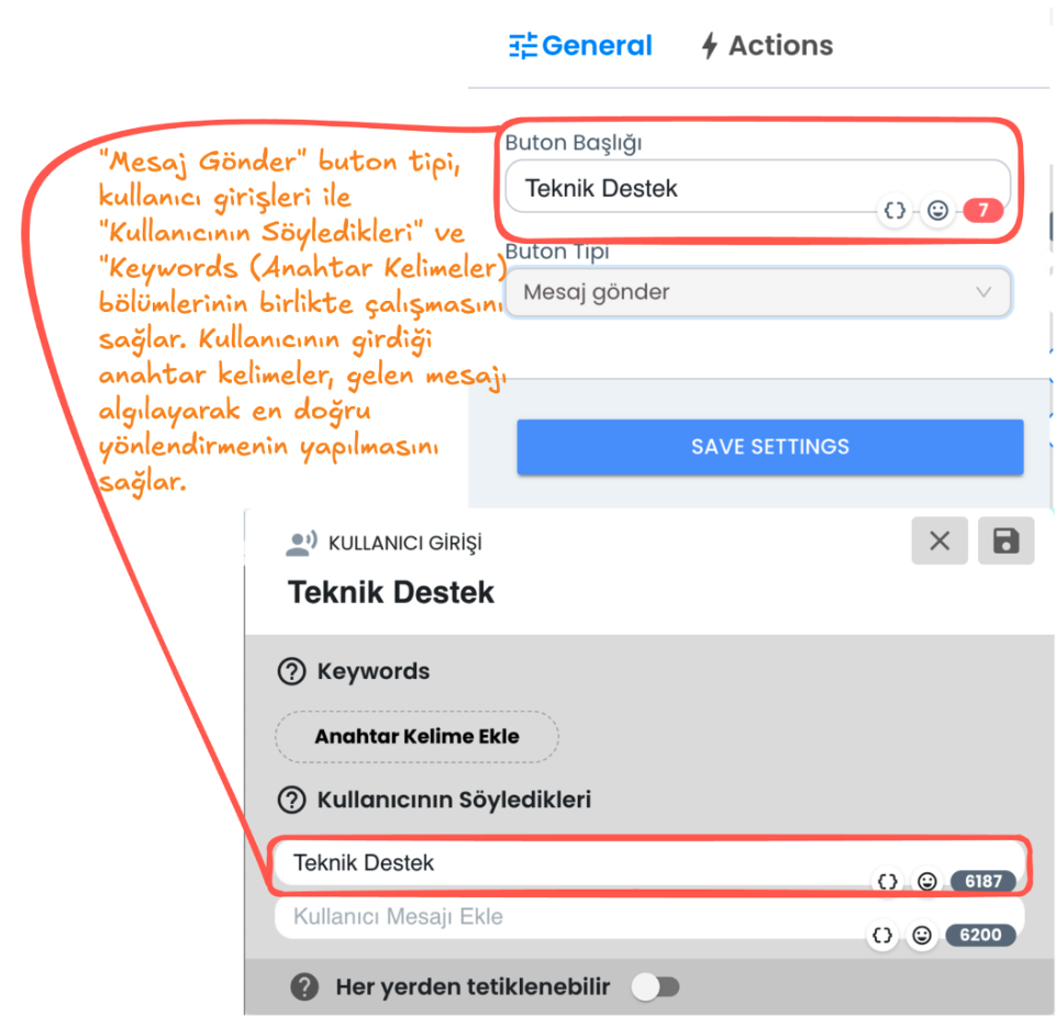
2) Send Message Button Type
"Send Message" Button Type This button type sends the content of the button the user clicks on to the chatbot as a message. By offering specific buttons to the user, button contents are analyzed through keywords and directed to relevant sections.
-
Button Title: You can determine the button name visible to the user. When the user presses this button, the content in the button title is transmitted to the chatbot as a message.
-
Keywords and What the User Says: By matching the message entered by the user or the input taken from the button content with keywords, it ensures that the chatbot continues through the correct user input. This way, when the user writes a specific word, the bot detects this message and provides the relevant direction.
Additional Features
1. Set Department, Add Tag, Transfer to Representative
1-) User Input Direction
The selections or message content made by users are captured by the system. Input is detected through keywords in the message content or according to the person's selection. This way, the system detects what the user wants help with and provides appropriate direction.
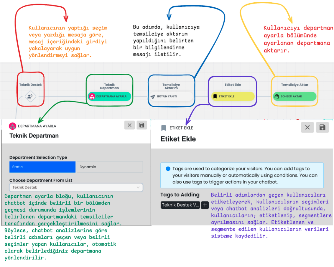
2-) Department Direction
Set Department enables users to be directed to a specific department. Users who pass through a determined step in the chatbot or make a specific selection are automatically assigned to the set department. For example, when "Technical Support" is selected, this user is directed to the technical support department or you can perform department setting by analyzing their needs in the steps they pass through according to the user's selections.
3-) Representative Transfer Information
The user receives an information message that they will be transferred to a representative. This message gives the user the feeling that the process is being followed and they will be transferred to a live support provider. This way, the user gains confidence by seeing that the process is working.
4-) Adding Tags
The Tagging Block is used to tag users who pass through specific steps or make specific selections. Tags enable users to be segmented and easily identified in chatbot analyses. Tags added to users enable them to be segmented according to their selections and interactions within the chatbot. This data can be filtered within the chatbot, and the data is also stored in the system for user analyses and segmentation.
5-) Representative Transfer
Transfer Chat removes the sessions of users who come to specific steps from the chatbot and transfers them to the relevant department if a department is set, or to any of the live support representatives according to the automatic chat assignment algorithm if no department setting is made.
2. Filter, Go to Step, Process Data, Take Request, Create Ticket
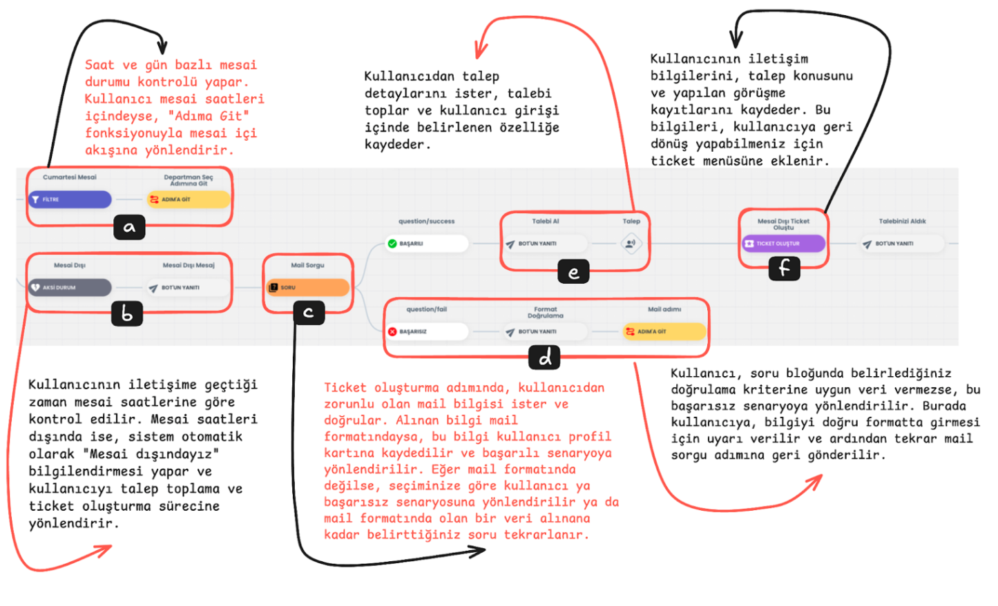
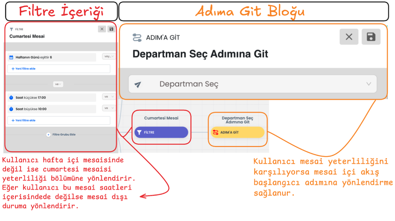
a-) Working Hours Status Check and Go to Step
The hour and day when the user contacts is compared with working hours. If it is detected that they are within working hours, the user is directed to the working hours flow using the "Go to Step" function. This step ensures that the user receives support during business hours.
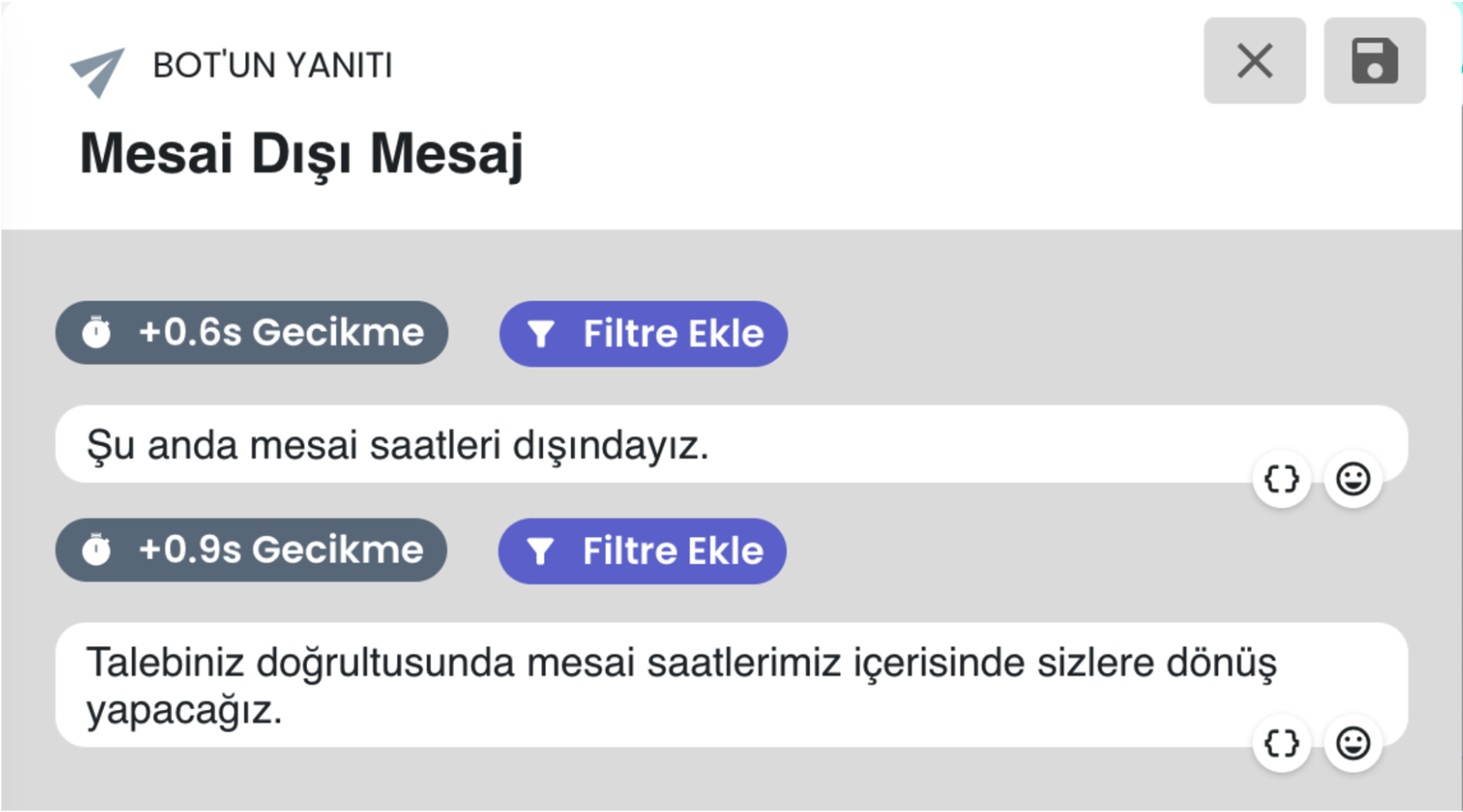
b-) Outside Working Hours Status
If the user contacts outside working hours, the system automatically gives an "We are outside working hours" notification and directs the user to the request collection and ticket creation flow. This allows the user to convey their support request 24/7.
c-) Question Block
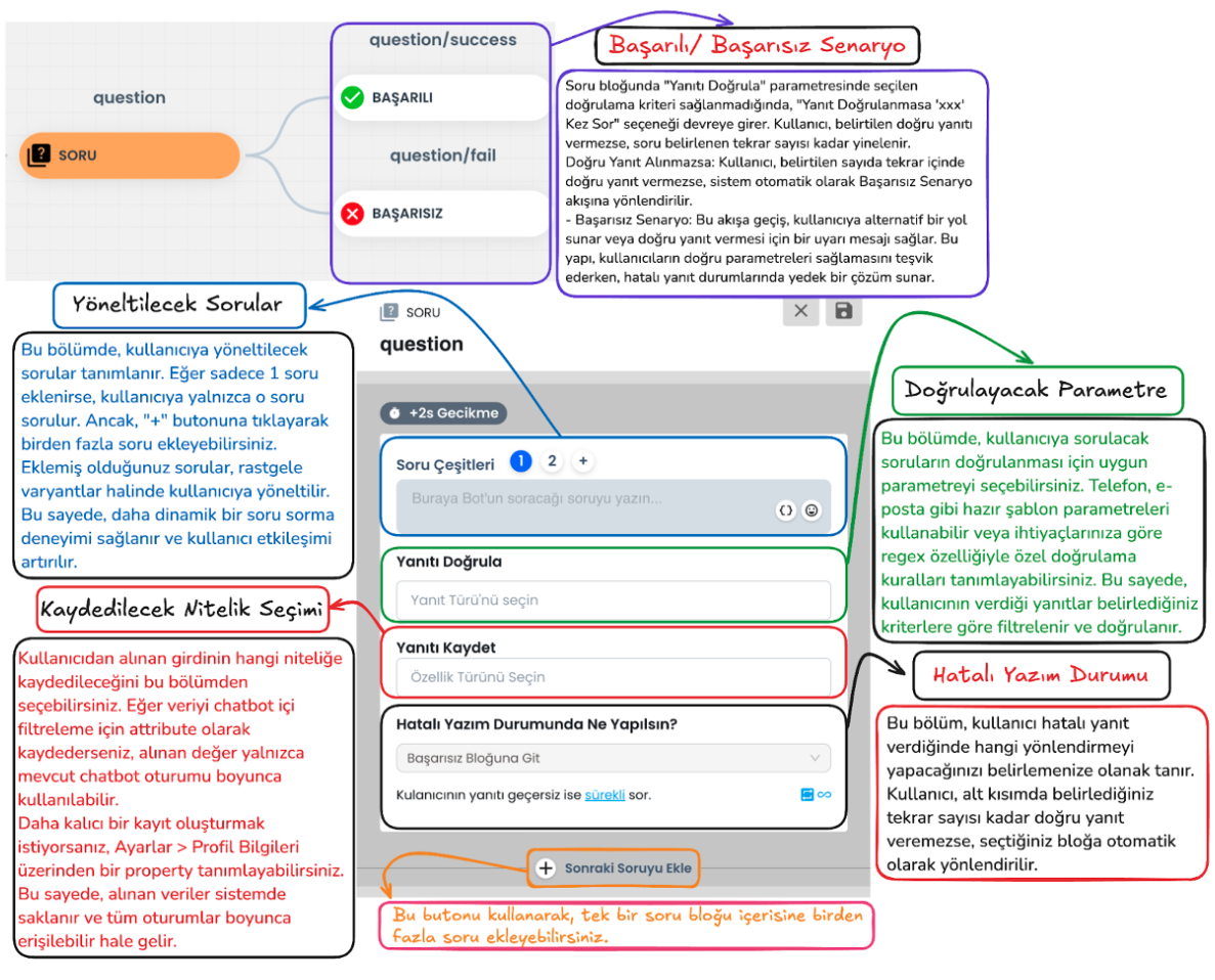
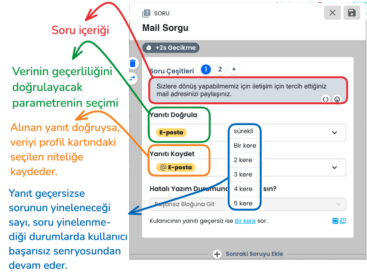
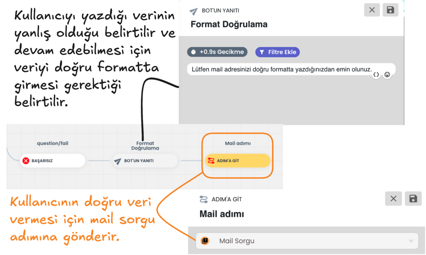
Question Block Email Query: In the ticket creation process, the user's email information is requested as mandatory. The Question Block takes the user's email address and checks whether this information is in the correct format.
d-) Question Block Failed Scenario:
Email address format validation is performed. If the email address is not in the correct format and the user's response is invalid, it directs the user to the failed scenario according to the query count you select from the "ask the user's response if invalid .. times" section, or the same question is repeated until the correct email format is provided. When the email is entered correctly, the entered information is saved to the profile card and the user is directed to the successful scenario.
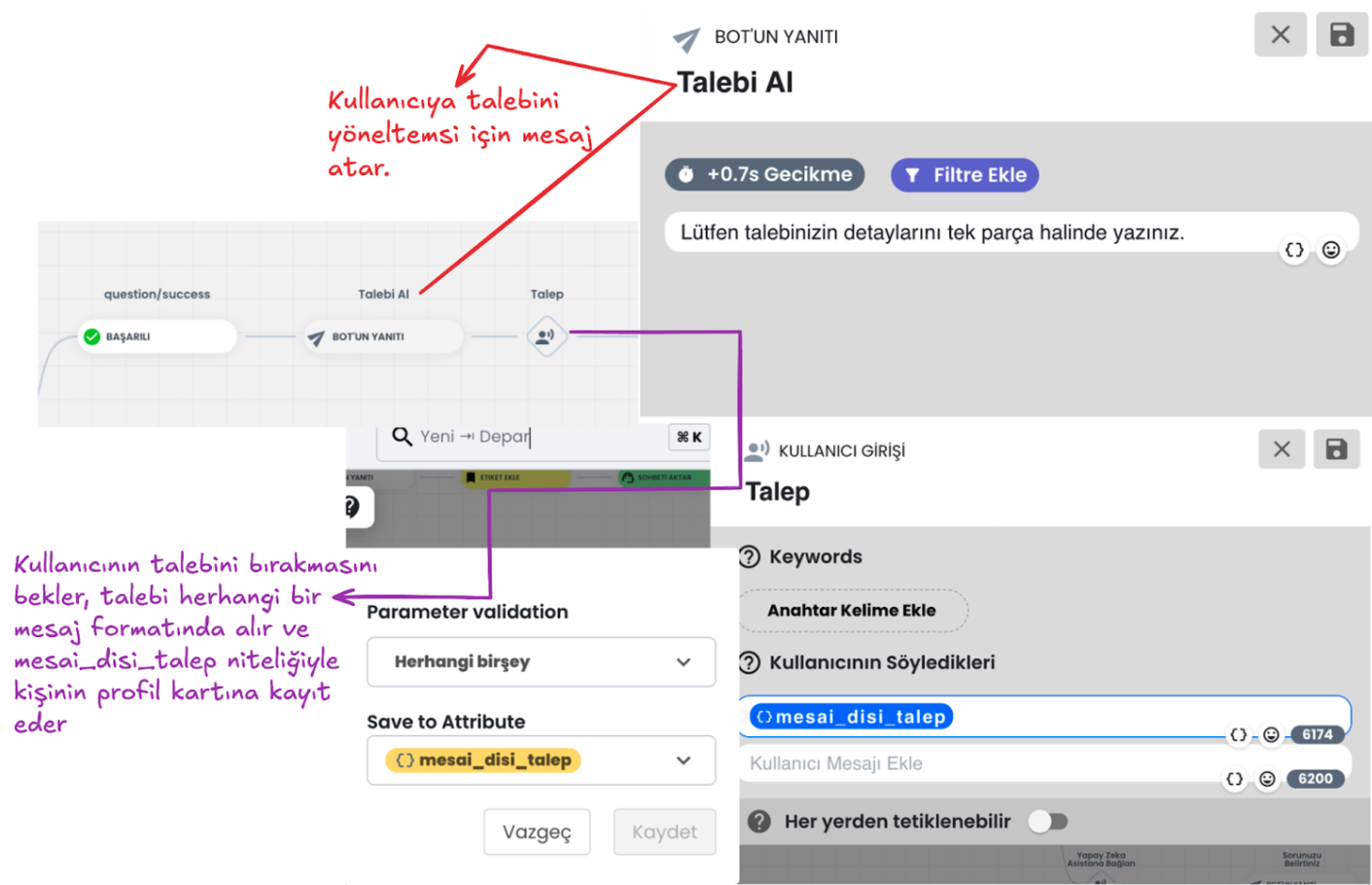
e-) Successful Scenario Request Collection and Saving:
If the user provides the data correctly, they continue from the successful scenario. At this stage, they are asked to convey the request details. You can save this information provided by the user to the attribute you determine in the user profile, or you can continue without saving the data. This information allows the user to clearly express their support request.
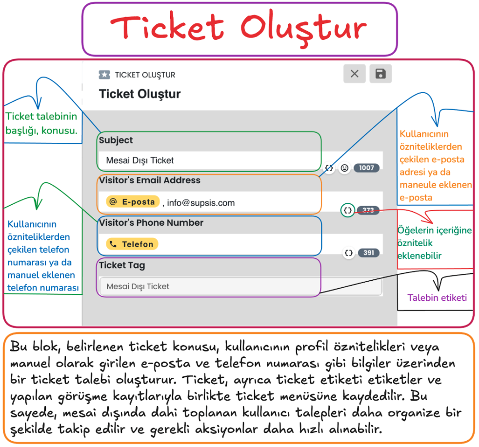
f-) Ticket Creation
Create Ticket saves user contact information and request details and saves this information to the ticket menu that will enable systematic management of support requests.
This step helps process user requests in a more organized and faster way by saving the user's contact information (email and phone number) and request topic.
Steps
1) Request Subject
- A title is determined according to the user's requests. For example, a general topic such as "Outside Working Hours Ticket" can be selected.
- The request subject facilitates quick search and analysis in the ticket system.
2) Email Information (Visitor's Email Address)
- If the user's email address is registered in the system, it is automatically added.
- If no email address is found in the system, it can be entered manually.
- Email information facilitates the user's communication with the support team and tracking of the request.
3) Phone Number (Visitor's Phone Number)
- The user's phone number is retrieved from registered attributes in the system or added manually.
- The phone number can be used to provide easy access to the user and respond quickly.
4) Ticket Tag
- A tag can be added according to the content of the request when creating the ticket record (for example, "Outside Working Hours Ticket").
- Tags enable filtering and categorization of tickets.
Important Note
- Mandatory Email Information: To create a ticket, either a registered email address in the system or a manually entered email address must be present in the ticket block content.
- If no email address is available, manual entry can be made or communication can be provided through the phone number.
3. Additional Menu
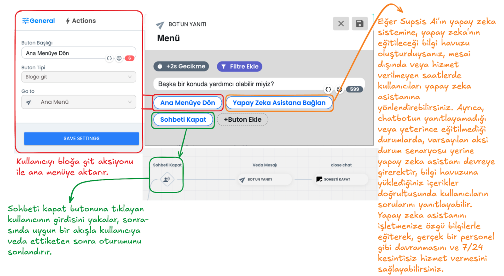
The Additional Menu can increase the quality of the chatbot experience and the solution status by offering various options to the user at the end of the chatbot flow. It can offer a more flexible and interactive experience. Below is an example chatbot menu. Through the buttons in this example menu, the user can: return to the main menu, end the chat, or be directed to the AI assistant to find answers to more complex questions and requests. At the additional menu stage, you can customize the chatbot additional menu content for your business by providing customizations as needed. The Additional Menu increases the support options offered by the chatbot to the user and provides flexibility. This way, the user can access the most appropriate direction for their needs.
1-) Return to Main Menu
When the user clicks this button, they return to the main menu step with the go to block interaction. This button allows the user to return to the very beginning in the chatbot flow and discover other options they need.
2-) Connect to AI Assistant
If there is a situation where the chatbot cannot respond (it automatically comes into play at this stage) or if the user wants to get support for complex situations outside working hours, they are directed to the AI assistant through a button you provide. If the AI module is activated, the AI assistant will automatically come into play in situations where the chatbot cannot respond. The AI assistant can help like a real staff member and answer questions according to the information you load into the system specific to your business and the instructions you give. By training the AI assistant, you can give it functions like a real human and make your customers feel that you are always with them. You can get support from this documentation page to integrate AI into your chatbot system.
3-) Close Chat
With this option, the user can end the chat session. A farewell message is sent to the user who clicks the close chat button and the session is terminated.