Things to Consider in Button Blocks
The bot's responses manage the interaction style established with the user through the inputs received by the chatbot. Among the bot response types that direct users to buttons; there are various interaction options such as quick reply, button and gallery cards. Each response type has basically the same function, but offers a different experience to the user with small functional changes and visual changes. For example, the quick reply button type is used in the image below.
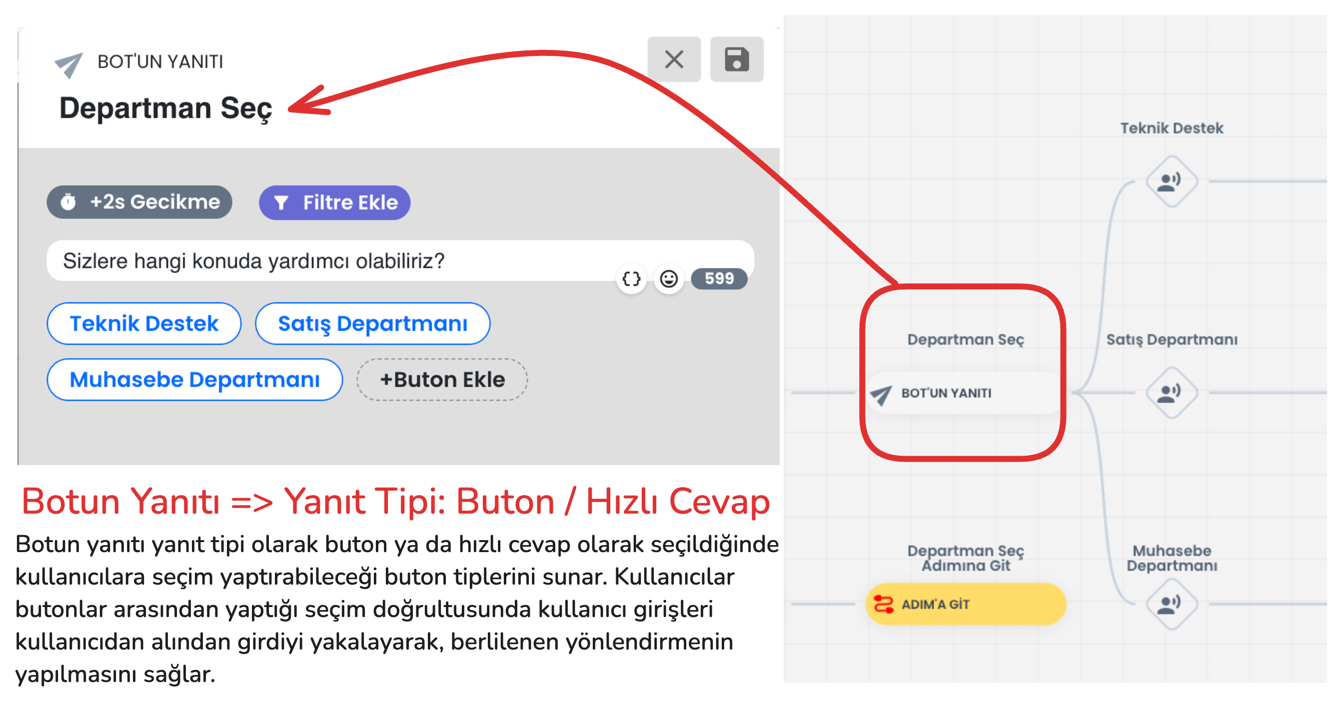
In addition to visual appearance differences between these button types, there are also functional differences. The functional differences between button types are explained in the section below. After learning the details and selecting the appropriate button type, you can set up your flow appropriately.
- Quick reply:
- Usage Purpose: Enables the user to make a quick selection. After the user makes a selection, this response disappears and the bot moves to the next step.
- Features:
- Quick reply button type; takes input from the user specifically for website, Instagram and Messenger and disappears.
- Unlike other button types on the Instagram platform, it allows adding more than 3 buttons and presents the buttons just above the message box, the button aesthetics change. However, this button type has no functional difference on other platforms.
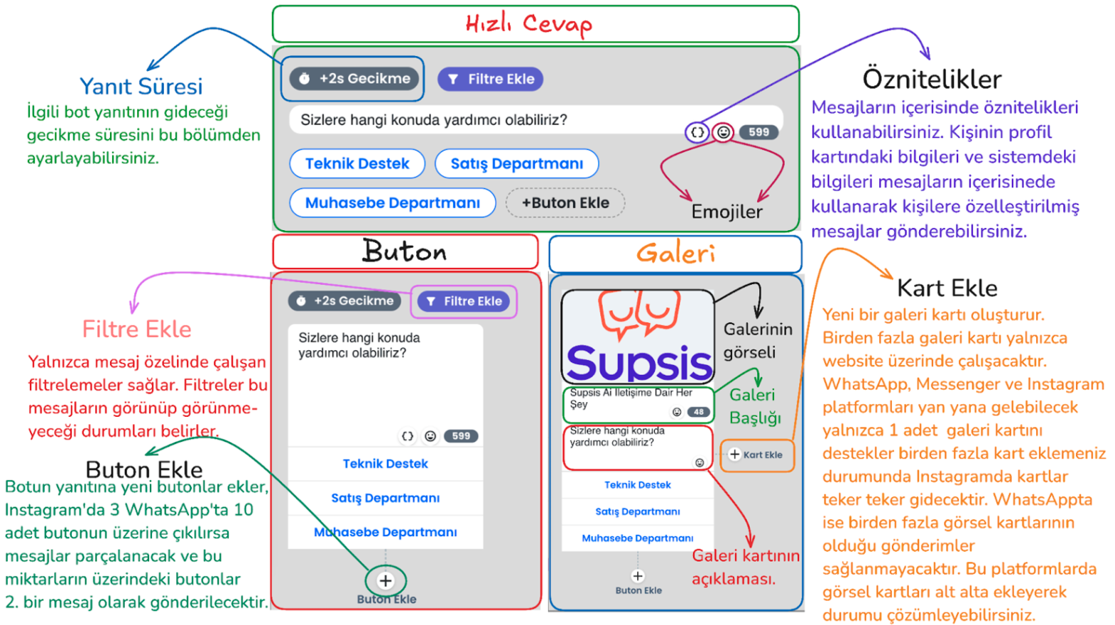
Button - Usage Purpose: Offers specific options to the user, has no additional features. Buttons remain on the screen after the user makes a selection on all platforms.
Gallery - Usage Purpose: Used to make a more interactive presentation by adding visuals and descriptions. - Features: Can have a visual title, description and a maximum of 3 buttons below. In WhatsApp, more than 1 gallery card cannot be placed side by side, otherwise message sending will not be performed. - Can have a visual title, description and a maximum of 3 buttons below. You can add as many buttons as you want to this bot response type on the website platform. On other platforms, a maximum of 3 buttons can be added. - In WhatsApp, a maximum of 1 gallery card can be sent on platforms, if you add additional cards side by side, the bot's response will not go. On Instagram and Messenger side, each gallery card you add will go as a separate message.
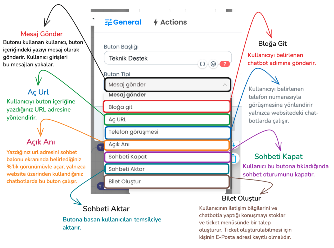
In the example above, send message and go to block button types should be used to create the flow we use in the flow. Through these button types, the bot can understand the user's request and provide appropriate direction. However, there are additional button types you can use in addition to these button types.
- Send Message: The user clicks the button to convey the message in the button's content, the bot processes the input received from the user and provides appropriate direction.
- Go to Block: Sends the user to the specified chatbot step
- Open URL: Redirects the user to a URL you specify.
- Phone Call: Redirects the user to call a specific phone number (website chatbot only).
- Open Moment: Opens the specified URL on the chatbot screen in the size you specify.
- Close Chat: Ends the chat session of the user who presses this button.
- Transfer Chat: When the user clicks this button type, the chat session is transferred from the chatbot to the live support representative. The representative takes over the chat.
- Create Ticket: Saves the user's contact information and chat content and conveys it to the support team as a ticket. A ticket will only be created if the user's email information is available on the Supsis site, if you have received email information from the person before or if you get this information from the user through the chatbot.
Things to Consider
- Button Limits:
- Instagram and Messenger: Maximum 3 buttons in a single bot response.
- WhatsApp: Maximum 10 buttons in a single bot response.
-
Limit Exceeded Situations:
- If 5 buttons are added in Instagram and Messenger, the first 3 buttons are displayed in the first message, and the remaining 2 buttons are displayed in the second message.
- If there are 12 buttons in a bot's response during WhatsApp usage, the first 10 buttons are sent in one message, and the remaining 2 buttons are sent in the next message.
-
Button Content Length:
- Character Limit: In WhatsApp, Instagram, Messenger and Telegram, a button can be maximum 20 characters. Contents longer than 20 characters only show the first 20 characters.
- Web: There is no character limitation on the website.
- Platform Limitations:
- Some button types do not work on every platform. However, there are no restrictions on button usage on the website.
-
Supported Button Types (Instagram, Messenger, Telegram and WhatsApp): Send Message, Go to Block, Close Chat, Transfer Chat, Create Ticket (Ticket creation only becomes active if the user's email information is available).
-
Gallery Cards:
- Web: There are no restrictions on the use of gallery cards on the website.
- Other Platforms:
- Maximum 3 buttons can be added to the gallery card.
- In WhatsApp, more than 1 gallery card cannot be placed side by side, otherwise message sending will not be performed.
- If more than one gallery card is added on other platforms, the cards are transmitted by splitting.
These rules are important details for the chatbot to work properly on different platforms. These rules must be followed during setup.